

%20-%20Hyde%20October%202022/DSC05700.jpg?width=300&name=DSC05700.jpg)

%20-%20Seaforth%202024/Low%20Res/DIS-HAR5-ausmar-sunshine-coast-harmony-display-home-seaforth%20(73).jpg?width=300&name=DIS-HAR5-ausmar-sunshine-coast-harmony-display-home-seaforth%20(73).jpg)


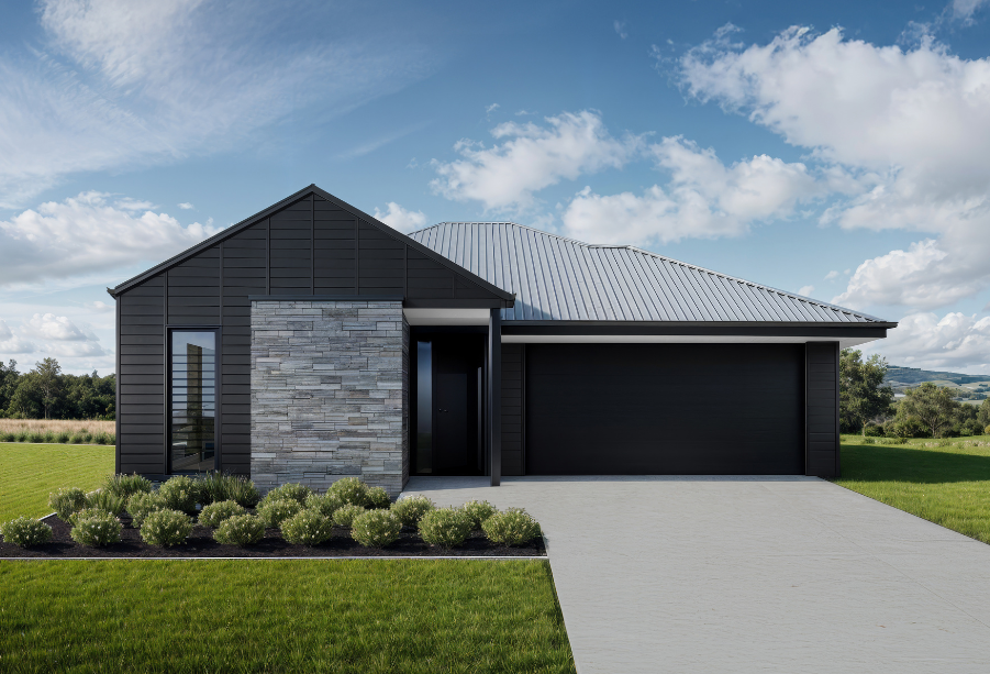
Dark-and-moody interiors have become a go-to style for those seeking drama and sophistication - but most people are getting it wrong.
 Dark and moody without using flat black finishes | Design by DCM Building Design; built by AUSMAR
Welcome to this week’s Friday Flatlay, where we’re diving into the world of rich tones, layered textures, and shadowy ambiance. Today’s design focus? Building a First Series home using a dark-and-moody palette - without defaulting to stark black and white.
/Blog_Friday%20Flatlay%20Embracing%20Dark%20and%20Moody%20(Without%20Falling%20into%20the%20Black%20Trap)%20(4).jpg?width=1030&height=700&name=Blog_Friday%20Flatlay%20Embracing%20Dark%20and%20Moody%20(Without%20Falling%20into%20the%20Black%20Trap)%20(4).jpg)
Let’s Debunk a Few Myths First
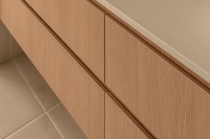
When people hear “dark and moody,” their minds often jump straight to high-contrast whites and blacks. But true moody interiors are far more nuanced. Think Harry Potter - not a single true black in sight. Yet the castle oozes atmosphere and depth. It’s stone, timber, texture, and tone. That’s the essence of moody design: layers, not contrast./Blog_Friday%20Flatlay%20Embracing%20Dark%20and%20Moody%20(Without%20Falling%20into%20the%20Black%20Trap)%20(2).jpg?width=1030&height=700&name=Blog_Friday%20Flatlay%20Embracing%20Dark%20and%20Moody%20(Without%20Falling%20into%20the%20Black%20Trap)%20(2).jpg)
So, What Should You Use Instead?
Start by embracing tonal variety. Instead of flat black, go for:
- Warm charcoals
- Earthy greys
- Stone-like textures
- Dark, muted greens or browns
- These colours carry mood without the harshness of jet black.
/Blog_Friday%20Flatlay%20Embracing%20Dark%20and%20Moody%20(Without%20Falling%20into%20the%20Black%20Trap)%20(1).jpg?width=1030&height=700&name=Blog_Friday%20Flatlay%20Embracing%20Dark%20and%20Moody%20(Without%20Falling%20into%20the%20Black%20Trap)%20(1).jpg)
Tapware Tips: Ditch the Black
Black tapware has become a default in modern homes, but it often flattens a moody design. In a dark-toned palette, you want your fixtures to reflect light and add subtle contrast./Blog_Friday%20Flatlay%20Embracing%20Dark%20and%20Moody%20(Without%20Falling%20into%20the%20Black%20Trap)%20(3).jpg?width=1030&height=700&name=Blog_Friday%20Flatlay%20Embracing%20Dark%20and%20Moody%20(Without%20Falling%20into%20the%20Black%20Trap)%20(3).jpg)
Our picks:
- Chrome - A classic, reflective finish that mirrors its moody surroundings.
- Brushed Nickel - The elevated version of chrome - softer, more refined, and perfect if you’ve got a little extra budget.
The Challenge
If you’re planning a dark-and-moody home, challenge yourself to skip the black altogether. Focus on tone, warmth, and texture. Use materials and finishes that feel natural, layered, and lived-in.
It’s not about being dramatic - it’s about creating depth and atmosphere without being cold or stark.
Stay tuned for next week’s Friday Flatlay. Until then, rethink black - and embrace moody, the textured way.