START YOUR
BUILDING JOURNEY
START YOUR BUILDING JOURNEY
![]()
![]()
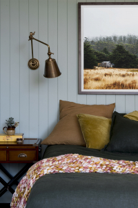
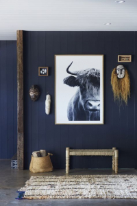
We tend to give a nod to our unique Australian landscape in all of my interiors in one way or another. There is something special about our island nation that we love to see celebrated in our homes. This material board pays homage to our country in a more overt way with its earthy greens and pops of rust, warm timbers and rich metals.
Credit: Cedar and Suede
Laminex Seed set the tone for this scheme. We had the colour matched to a paint colour, Dulux Still, which in practice gives the opportunity to repeat the colour however we want. Repeating colours this way in an interior scheme can be very effective in creating a sense of calm and cohesiveness, which is generally what I aim for in my interiors. For instance, you might like to use a Laminex colour on the kitchen cabinets and paint the surrounding walls in the same colour. We also have some experience using Laminex Possum and Laminex Seed as cabinetry fronts and can confirm they make for a beautiful, sophisticated finish.
Credit: Cedar and Suede
If you can slip some decorative wall panelling into your interior scheme it’s a sure way to elevate your space. The demi round MDF wall panelling (Laminex Surround Demi round 20) reminds us of corrugated iron which feels iconically Australian, but it’s also quite a contemporary profile that could be used behind a TV or bedhead to add some dimension and pattern.
Credit: Laminex
The fluid pattern of the large tile in the scheme creates the backdrop to this look and the pops of rust have made it easy to tie back the ochre colours in the board. We’d use a tile such as this as a floor tile where we believe it would make a beautiful foundation. Although, we’d avoid using it on a wall application where you risk the pattern being too busy.
Credit: Cedar and Suede
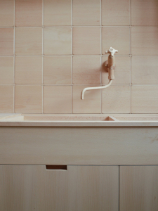
We’ve opted for bronze metal in this scheme which feels on-brand with my Australiana look and feel. The board depicts a combination of living bronze and electroplated bronze which we wouldn’t place side by side or even in the one room, but you could certainly use a combination of both in the home. Living bronze is uncoated and will beautifully patina over time. It’s also in a higher price bracket so we’d include it in heavy-use space like the kitchen and potentially opt for the more cost-effective option for the bathrooms and/or laundry. In both cases, the warmth of the colour feels perfect, not grabbing any attention, just gently enhancing the look.
Natural, breathable fibres like linen and cotton textiles feel like a natural integration into an Australian inspired theme. we’d love to see these linens used to upholster a bedhead or made into cushions covers.
In contrast, to the subtle linens, the chunky loop pile wool carpets add rich texture and a sense of luxury. They could even inspire a beautiful rich rug for a living room or for under a bed if you didn’t want to commit to wall to wall carpet.
Creating a mood board for the design of your future home will not only assist with communicating your vision to your colour-selection specialist but will also give you confidence in the outcome of your home design. A reference you can always go back to in future, keep your Australian inspired mood board close during your home selections process.
Don’t forget to share with us your mood board design by tagging @ausmarhomes on Facebook and Instagram.
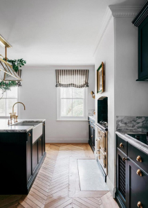
Whether you’re creating your first home or forever home a classic interior will confidently stand the test of time. Keeping true to what we know lights us up, our take on a classic look leans to a broody and masculine feel but feel free to spin it however your heart desires.
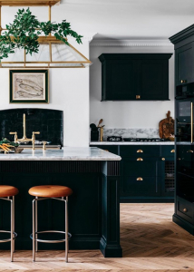
Credit: Steve Cordony
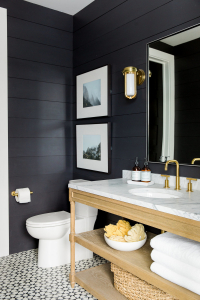
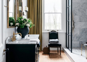
Nothing feels more classic to me than a simple and strong, black and white colour palette. We love a space with mood and meaning, our darks are inclined to outweigh our whites but your approach can be anything you want it to be. We were drawn to the warm, brown undertones of this particular paint colour. It’s a softer take on a standard black paint and in general and it’s indicative of a movement happening in the interior where you can expect to see warmer undertones in colours across the board.
Interior Design and Photography: Studio McGee
Marble or marble-look is a staple in a classic scheme whether used as a floor tile, bathroom wall tile or as a splashback, it always says elegance. It’s hard to go past the organic vein of natural marble but if the budget doesn’t allow it, marble-look finishes can achieve a similar effect. In this case, we’ve opted for the Cava Borghini Satin tile (a marble-look) for its honey-hued veins which we’d lay on a bathroom floor but we’ve also added some real marble by the inclusion of the fluted marble mosaic which would make a luxurious shower tile. If you’re choosing a big slab of marble for something like an island bench, we suggest visiting your stone supplier and personally selecting your slab. Natural stone can vary wildly from slab to slab, which is in fact, the beauty of it.
Credit: Steve Cordony
The Heritage wall panelling is synonymous with a classic scheme, but we think it can be used in so many styles of a home if you’re looking for a way to add character. The dark timber-look vinyl flooring I selected here we love for its richness and warmth and of course, with a bigger budget you would opt for an engineered timber. Vinyl serves the purpose of being cost-effective and being relatively indestructible but it’s hard to go past timber.
The polished chrome T handle pops off this board, elevating the look to more luxurious than casual. Polished chrome is the ultimate in simple elegance and works beautifully with matte black hardware if you’re inclined to mix your metals.
Credit: Steve Cordony
Your soft furnishings selections process is crunch time. It’s your opportunity to really double down on your scheme. ew will never not love a stripe. To us, it’s hands down the most versatile pattern which can swing between classic and contemporary depending on the type of stripe and the greater context. we especially love to see an elegant ticking stripe (fine stripe) in partnership with a larger scale pattern in similar colourways. It’s an opportunity to create subtle contrast without adding colour. It’s timeless and effortlessly chic.
Creating a mood board for the design of your future home will not only assist with communicating your vision to your colour-selection specialist but will also give you confidence in the outcome of your home design. A reference you can always go back to in future, keep your Classic inspired mood board close when during your home selections process.
Don’t forget to share with us your mood board design by tagging @ausmarhomes on Facebook and Instagram.
A European-inspired scheme feels especially on-point right now. It’s centred on a look that’s rich in texture, reflected in a tonal colour scheme, layered in neutrals with warm undertones. When it comes to decoration in this scheme, it’s about showcasing few pieces but making sure each piece is a piece of art in its own right.
We’ve kept the colour palette in this look very tonal which highlights the range of textures in the materials. The warm pink undertone of the tile was my starting point and in painting the batten board in Dulux Eggshell Pink Quarter we’ve extended the colour, allowing the materials to do the talking. Laminex Peruvian Clay and Laminex Porcelain blush are perfect laminate colours to complement the scheme. We’ve seen these colours work beautifully together in joinery.
Credit: Design Hunter UK
The Laminex batten board (Laminex Surround Batten 25) feels very contemporary with its deep grooves and linear architectural profile. We love how it juxtaposes the more organic, fluid pattern in the tile and would make a striking wall detail.
The simple, small square tiles add to the materiality without introducing a new colour. They’d add life to a kitchen splashback or bathroom wall. It’s also worth noting that you shouldn’t feel compelled to tile an entire bathroom. The floor and shower walls obviously require tile or alike, but you may prefer a wall panelling or even just plasterboard on the remaining walls.
The aged bronze handle adds a sense of warmth to a space and its muted finish makes it very easy to work into any scheme. You could also use brushed or living brass or copper (warm metals) in this scheme with similar success. The scale of the handle also adds an element of drama, perfect for a restricted colour palette such as this.
Credit: YSG
The rich walnut timber grain laminate provides enough contrast to help anchor the look and is a more budget-conscious option than a timber veneer to apply to kitchen cabinets, TV units or bathroom vanity. And the PGH Morada Ares brick is the most sublime colour that I would easily introduce on the face of an indoor fireplace and/or plinth. The PGH Fieldstone Aspen dressed, is the organic element that this space needs to keep the space feeling relaxed.
Credit: Sarah Ellison
The approach to decorating your European scheme relies on providing layers harmoniously. Grasscloth wallpaper has been used for hundreds of years in homes. It adds texture without adding a pattern into the mix, which I think goes towards the timelessness of this scheme.
Boucle fabric included in the scheme is having a real moment in interiors right now. Its highly tactile composition adds a sense of sophistication and softness that makes you want to curl up and just melt into the space. It’s even more luxurious paired with a rich, smooth velvet. Then there is tan leather which can just so easily slip into any interior scheme like a quiet, loyal friend, ideal on a sofa or banquette seat.
Credit: Three Birds Renovations
Creating a mood board for the design of your future home will not only assist with communicating your vision to your colour-selection specialist but will also give you confidence in the outcome of your home design. A reference you can always go back to in future, keep your European inspired mood board close during your home selections process.
Don’t forget to share with us your mood board design by tagging @ausmarhomes on Facebook and Instagram.
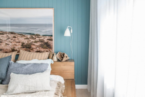
It’s easy to understand why Australians love a coastal-inspired aesthetic when we enjoy some of the best coastlines in the world. However, drawing inspiration from our coastal surroundings and applying this in your home interior can be easier said than done. Start by creating a mood board that depicts an array of inspirational images and a suggested colour palette to give you a sense of the overall look and feel of your ideal coastal-inspired space.
Whilst there are many different interpretations of a coastal scheme, we have put together what we would coin quite a traditional coastal look in terms of colour, modernised by pattern and texture in my selections.
Credit © Tigmi Trading
We’ve often said a good, true navy is like a neutral. It will stand the test of time. Dulux Surf n Dive, would make a striking feature as kitchen or laundry joinery or even a bedroom wall colour. We advocate painting all walls in a space the one colour to avoid stark contrast that can come from feature walls.
Layering similar shades of one colour and saturating the space creates a feeling of calmness and consistency, which is where materials such as the Laminex French Navy and Laminex Winter Sky come into play. Both would make for impactful cabinet fronts and at a slightly lesser cost than 2pac painting.
Credit: Kyal and Kara
The large tile that forms the foundation of this mood board sets the tone for this scheme. We fell instantly in love with the Frammenta tile from National Tiles which is inspired by an Italian stone and is something we’ve used in multiple interiors already. The irregularity of the aggregate and subtle variation of colour provides a really interesting, neutral base from which to build a palette. The sandy colours that appear in this tile offer an opportunity to include other warmer neutrals which are fundamental to any good interior. Whilst whites and greys can play a role in this look, they need those warmer tones that come from things like the beautiful organic face stone.
Credit: Kyal and Kara
The colour of the Aspen Dressed Fieldstone from PGH Bricks, references other blonde shades in materials, such as the oak timber engineered flooring, cabinet handles and the timber grain laminate. Timber grain laminate always makes for successful joinery and my brass selections, as depicted by the tapware, seamlessly add to the tonality of the board.
Credit: Style Curator
If your budget can accommodate some wall panelling, a simple 100m vertical joint board is synonymous with coastal design and is so effective at adding depth to an interior. The more interest you can achieve in your building materials, the less work you have to do in the decorating process.
Credit: Kyal and Kara
It is however the decorating process that is always the cherry on top in interior design. Think of your soft furnishing choices like jewellery. The type of fabrics you choose for things such as your window dressings or bench seat cushion tops will decide whether your coastal home is casual, formal, contemporary, classic or whatever mood and style you want to achieve. Contrasting patterns and scale is a sure way to achieve a home packed with personality, which is a home you’ll always be proud of.
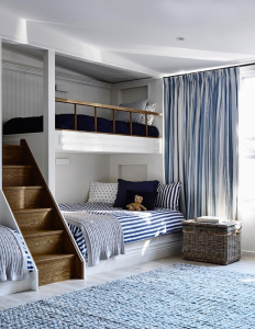
Credit: Adelaide Bragg
Creating a mood board for the design of your future home will not only assist with communicating your vision to your colour-selection specialist but will also give you confidence in the outcome of your home design. A reference you can always go back to in future, keep your Coastal inspired mood board close during your home selections process.
Don’t forget to share with us your mood board design by tagging @ausmarhomes on Facebook and Instagram.
![]()
![]()