Introducing the new look ‘AUSMAR’
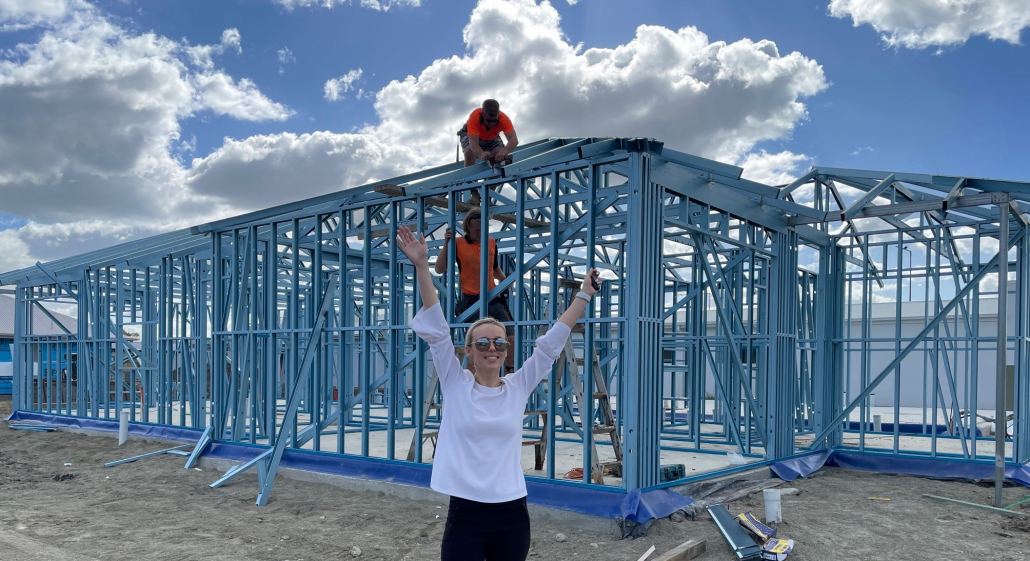
Hi! I’m Kate. I’m the Marketing Manager here at AUSMAR, and I’ve been with the company for more than 8 years now. I’ve been heading up our brand refresh project since back when it was just a hopeful glint in my eye (i.e. July 2020), and today I wanted to take over the blog to share some insights about the whys, whats, and (w)hows of our new look. We know words like “brand refresh” or “rebrand” can often feel a little overwhelming, so right from the outset, we want to highlight that our homes and how we build them haven’t changed. So what has changed, and why? Let’s get stuck in.
Why did we refresh our brand?
If you’ve ever been involved in a brand refresh, you’ll know it’s not a decision that’s made lightly. There’s no right time to start, but the reasons to do it keep stacking up until they start to outweigh the reasons not to. For us, the primary reasons to refresh were:
1/ Our logo has left our business stuck in the past. There was no hiding our logo was starting to look tired
2/ To create a visual identity to support our business services as we grow
3/ To deliver a brand which remained relevant and aligned with our ever evolving environment
4/ Ensure we could deliver a consistent, cohesive AUSMAR experience no matter where our brand was seen
1/ Our logo was stuck in the past
It has been weighing on our team for a while now that our brand was not a true reflection of who we are today. Our teams on site and internally have grown, with added services to our business and build region growing from South Brisbane up to Gympie. Our brand for a while had begun to look more tired and dated, which is a stark contrast to the modern home designs we have since developed. Keeping up with the market, it was becoming more apparent a refresh was necessary to align our business with the style of homes we build.
2/ Our brand needs to support our business growth
Our new look allows us to stay more focused than ever on how far we’ve come, and where we are headed as a business. It’s amazing to witness the collaboration of so many departments, different talents and dynamics coming together to work on building something even more special, which is making the dream of home ownership a reality. Our goal as a business has always been to allow for such brilliance and talent to grow. This brand refresh allows us to keep our eyes on the prize and stay more laser focused on building more opportunity.
3/ We needed a new look which aligned with the ever evolving environment
Home building is a relatively fluid environment that is always changing and adapting to new trends and styles. It was important to us to create a new look which reflected elements of being timeless, minimal and modern. If we’re being honest, home building is a stressful process. We didn’t want to add to this chaos with a brand that would scare our current clients, suppliers and key stakeholders. Our vision is to make building a home as easy and stress-free as possible, so our new look is a better reflection of the direction we’re headed with our client’s building experience.
4/ Delivering a consistent and cohesive AUSMAR experience
If you’ve followed AUSMAR for a while, you might be familiar with a few of the different service divisions we’ve had over the years. Most recently we’ve been operating under Ausmar Group, Ausmar Custom, Ausmar Commercial and Ausmar Homes. However, as our business grows we want to ensure we can continue to deliver a consistent and cohesive experience. This refresh felt like it was the right time for us to phase out the Ausmar Group and Ausmar Homes logos, simplifying our brand to primarily – AUSMAR.
Creating our visual identity
This part of the refresh journey was equally as daunting as it was exciting. When it comes to changing something people are used to, we have to tread carefully – and ensure any changes we make are being made for the right reasons.
The Ausmar Logo
Before we move on from our old logo, we should say thank you to it for the joy it brought us over the years. Our old identity has been a champion, and we’ve had some amazing moments under it. It’s been present for our most significant milestones: from hiring our team, to building new products, to opening our new Maroochydore HQ, to supporting local charities like Wishlist, to attracting and working with our wonderful clients. It’s brought us together. And we’ve had lots of laughs, learnings, and friendships along the way. So, to our old identity: thank you! We couldn’t have done this without you.
Introducing the new AUSMAR
We’re thrilled to introduce our new logo, and we can’t wait to make even more memories under it. We wanted to create a confident and approachable brand, underpinned by simplicity. We believe in our services. Moving forward, we want to make AUSMAR the go-to for home building. Period. With our new logo, we wanted to go for something timeless, minimal and modern. A brand you could trust for great value, quality and open communication. We stand by our pillars of honesty, integrity and transparency – underpinning everything we do. We believe our new look speaks of strength and a clear representation of our core values.
A brand new era for AUSMAR
You’ll notice some of the new changes in effect from today. Currently, our website is the biggest visual change, but you’ll also see our logo updated across our display homes, uniforms, printed materials, cars and office over time. This is just the beginning for our new look and we appreciate your patience during the transition period. We’re excited to have it to guide us as we build on our services, reach new milestones, and continue to grow. To our clients who embrace our services and bring the AUSMAR ethos to life: thank you for being part of our journey, and for letting us be a part of yours. We hope you’re as excited by this change as we are!
Same AUSMAR, NEW Look
As we slowly move into this new era of AUSMAR you will see the same quality homes that you know and love, blended with our new look and feel which has been created to represent strength and trust. We can’t wait to share this new phase with you, and stay tuned for more updates from our team.
What is Australian style interior design?
We tend to give a nod to our unique Australian landscape in all of my interiors in one way or another. There is something special about our island nation that we love to see celebrated in our homes. This material board pays homage to our country in a more overt way with its earthy greens and pops of rust, warm timbers and rich metals.
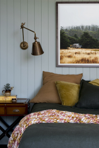
Credit: Cedar and Suede
Conceiving the colour palette
Laminex Seed set the tone for this scheme. We had the colour matched to a paint colour, Dulux Still, which in practice gives the opportunity to repeat the colour however we want. Repeating colours this way in an interior scheme can be very effective in creating a sense of calm and cohesiveness, which is generally what I aim for in my interiors. For instance, you might like to use a Laminex colour on the kitchen cabinets and paint the surrounding walls in the same colour. We also have some experience using Laminex Possum and Laminex Seed as cabinetry fronts and can confirm they make for a beautiful, sophisticated finish.
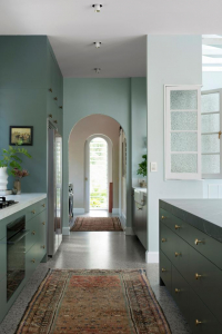
Credit: Cedar and Suede
Selecting your hard finishes and fixtures
If you can slip some decorative wall panelling into your interior scheme it’s a sure way to elevate your space. The demi round MDF wall panelling (Laminex Surround Demi round 20) reminds us of corrugated iron which feels iconically Australian, but it’s also quite a contemporary profile that could be used behind a TV or bedhead to add some dimension and pattern.
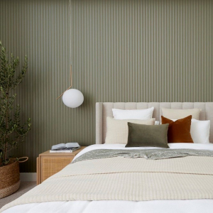
Credit: Laminex
The fluid pattern of the large tile in the scheme creates the backdrop to this look and the pops of rust have made it easy to tie back the ochre colours in the board. We’d use a tile such as this as a floor tile where we believe it would make a beautiful foundation. Although, we’d avoid using it on a wall application where you risk the pattern being too busy.
Credit: Cedar and Suede
We’ve opted for bronze metal in this scheme which feels on-brand with my Australiana look and feel. The board depicts a combination of living bronze and electroplated bronze which we wouldn’t place side by side or even in the one room, but you could certainly use a combination of both in the home. Living bronze is uncoated and will beautifully patina over time. It’s also in a higher price bracket so we’d include it in heavy-use space like the kitchen and potentially opt for the more cost-effective option for the bathrooms and/or laundry. In both cases, the warmth of the colour feels perfect, not grabbing any attention, just gently enhancing the look.
Soft furnishings
Natural, breathable fibres like linen and cotton textiles feel like a natural integration into an Australian inspired theme. we’d love to see these linens used to upholster a bedhead or made into cushions covers.
In contrast, to the subtle linens, the chunky loop pile wool carpets add rich texture and a sense of luxury. They could even inspire a beautiful rich rug for a living room or for under a bed if you didn’t want to commit to wall to wall carpet.
Let’s Get Started
Creating a mood board for the design of your future home will not only assist with communicating your vision to your colour-selection specialist but will also give you confidence in the outcome of your home design. A reference you can always go back to in future, keep your Australian inspired mood board close during your home selections process.
Don’t forget to share with us your mood board design by tagging @ausmarhomes on Facebook and Instagram.
How to do classic style interior design
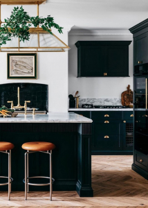
Whether you’re creating your first home or forever home a classic interior will confidently stand the test of time. Keeping true to what we know lights us up, our take on a classic look leans to a broody and masculine feel but feel free to spin it however your heart desires.
Credit: Steve Cordony
Conceiving the colour palette
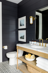
Nothing feels more classic to me than a simple and strong, black and white colour palette. We love a space with mood and meaning, our darks are inclined to outweigh our whites but your approach can be anything you want it to be. We were drawn to the warm, brown undertones of this particular paint colour. It’s a softer take on a standard black paint and in general and it’s indicative of a movement happening in the interior where you can expect to see warmer undertones in colours across the board.
Interior Design and Photography: Studio McGee
Selecting your hard finishes and fixtures
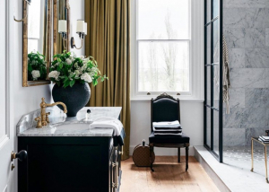
Marble or marble-look is a staple in a classic scheme whether used as a floor tile, bathroom wall tile or as a splashback, it always says elegance. It’s hard to go past the organic vein of natural marble but if the budget doesn’t allow it, marble-look finishes can achieve a similar effect. In this case, we’ve opted for the Cava Borghini Satin tile (a marble-look) for its honey-hued veins which we’d lay on a bathroom floor but we’ve also added some real marble by the inclusion of the fluted marble mosaic which would make a luxurious shower tile. If you’re choosing a big slab of marble for something like an island bench, we suggest visiting your stone supplier and personally selecting your slab. Natural stone can vary wildly from slab to slab, which is in fact, the beauty of it.
Credit: Steve Cordony
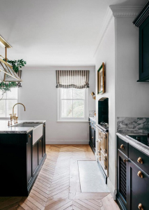
The Heritage wall panelling is synonymous with a classic scheme, but we think it can be used in so many styles of a home if you’re looking for a way to add character. The dark timber-look vinyl flooring I selected here we love for its richness and warmth and of course, with a bigger budget you would opt for an engineered timber. Vinyl serves the purpose of being cost-effective and being relatively indestructible but it’s hard to go past timber.
The polished chrome T handle pops off this board, elevating the look to more luxurious than casual. Polished chrome is the ultimate in simple elegance and works beautifully with matte black hardware if you’re inclined to mix your metals.
Credit: Steve Cordony
Soft furnishings
Your soft furnishings selections process is crunch time. It’s your opportunity to really double down on your scheme. ew will never not love a stripe. To us, it’s hands down the most versatile pattern which can swing between classic and contemporary depending on the type of stripe and the greater context. we especially love to see an elegant ticking stripe (fine stripe) in partnership with a larger scale pattern in similar colourways. It’s an opportunity to create subtle contrast without adding colour. It’s timeless and effortlessly chic.
Let’s Get Started
Creating a mood board for the design of your future home will not only assist with communicating your vision to your colour-selection specialist but will also give you confidence in the outcome of your home design. A reference you can always go back to in future, keep your Classic inspired mood board close when during your home selections process.
Don’t forget to share with us your mood board design by tagging @ausmarhomes on Facebook and Instagram.
Warm European-style home with neutral interiors
A European-inspired scheme feels especially on-point right now. It’s centred on a look that’s rich in texture, reflected in a tonal colour scheme, layered in neutrals with warm undertones. When it comes to decoration in this scheme, it’s about showcasing few pieces but making sure each piece is a piece of art in its own right.
Conceiving the colour palette
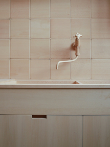
We’ve kept the colour palette in this look very tonal which highlights the range of textures in the materials. The warm pink undertone of the tile was my starting point and in painting the batten board in Dulux Eggshell Pink Quarter we’ve extended the colour, allowing the materials to do the talking. Laminex Peruvian Clay and Laminex Porcelain blush are perfect laminate colours to complement the scheme. We’ve seen these colours work beautifully together in joinery.
Credit: Design Hunter UK
Selecting your hard finishes and fixtures
The Laminex batten board (Laminex Surround Batten 25) feels very contemporary with its deep grooves and linear architectural profile. We love how it juxtaposes the more organic, fluid pattern in the tile and would make a striking wall detail.
The simple, small square tiles add to the materiality without introducing a new colour. They’d add life to a kitchen splashback or bathroom wall. It’s also worth noting that you shouldn’t feel compelled to tile an entire bathroom. The floor and shower walls obviously require tile or alike, but you may prefer a wall panelling or even just plasterboard on the remaining walls.
The aged bronze handle adds a sense of warmth to a space and its muted finish makes it very easy to work into any scheme. You could also use brushed or living brass or copper (warm metals) in this scheme with similar success. The scale of the handle also adds an element of drama, perfect for a restricted colour palette such as this.
Credit: YSG
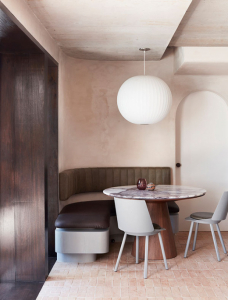
The rich walnut timber grain laminate provides enough contrast to help anchor the look and is a more budget-conscious option than a timber veneer to apply to kitchen cabinets, TV units or bathroom vanity. And the PGH Morada Ares brick is the most sublime colour that I would easily introduce on the face of an indoor fireplace and/or plinth. The PGH Fieldstone Aspen dressed, is the organic element that this space needs to keep the space feeling relaxed.
Credit: Sarah Ellison
Soft Furnishings
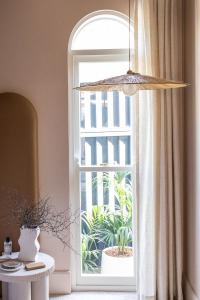
The approach to decorating your European scheme relies on providing layers harmoniously. Grasscloth wallpaper has been used for hundreds of years in homes. It adds texture without adding a pattern into the mix, which I think goes towards the timelessness of this scheme.
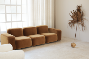
Boucle fabric included in the scheme is having a real moment in interiors right now. Its highly tactile composition adds a sense of sophistication and softness that makes you want to curl up and just melt into the space. It’s even more luxurious paired with a rich, smooth velvet. Then there is tan leather which can just so easily slip into any interior scheme like a quiet, loyal friend, ideal on a sofa or banquette seat.
Credit: Three Birds Renovations
Let’s Get Started
Creating a mood board for the design of your future home will not only assist with communicating your vision to your colour-selection specialist but will also give you confidence in the outcome of your home design. A reference you can always go back to in future, keep your European inspired mood board close during your home selections process.
Don’t forget to share with us your mood board design by tagging @ausmarhomes on Facebook and Instagram.
What is coastal interior design style?
It’s easy to understand why Australians love a coastal-inspired aesthetic when we enjoy some of the best coastlines in the world. However, drawing inspiration from our coastal surroundings and applying this in your home interior can be easier said than done. Start by creating a mood board that depicts an array of inspirational images and a suggested colour palette to give you a sense of the overall look and feel of your ideal coastal-inspired space.
Whilst there are many different interpretations of a coastal scheme, we have put together what we would coin quite a traditional coastal look in terms of colour, modernised by pattern and texture in my selections.
Credit © Tigmi Trading
Conceiving the colour palette
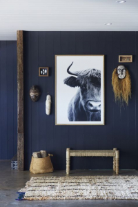
We’ve often said a good, true navy is like a neutral. It will stand the test of time. Dulux Surf n Dive, would make a striking feature as kitchen or laundry joinery or even a bedroom wall colour. We advocate painting all walls in a space the one colour to avoid stark contrast that can come from feature walls.
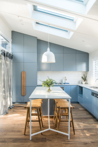
Layering similar shades of one colour and saturating the space creates a feeling of calmness and consistency, which is where materials such as the Laminex French Navy and Laminex Winter Sky come into play. Both would make for impactful cabinet fronts and at a slightly lesser cost than 2pac painting.
Credit: Kyal and Kara
Selecting your Hard Finishes and fixtures
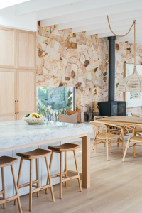
The large tile that forms the foundation of this mood board sets the tone for this scheme. We fell instantly in love with the Frammenta tile from National Tiles which is inspired by an Italian stone and is something we’ve used in multiple interiors already. The irregularity of the aggregate and subtle variation of colour provides a really interesting, neutral base from which to build a palette. The sandy colours that appear in this tile offer an opportunity to include other warmer neutrals which are fundamental to any good interior. Whilst whites and greys can play a role in this look, they need those warmer tones that come from things like the beautiful organic face stone.
Credit: Kyal and Kara
The colour of the Aspen Dressed Fieldstone from PGH Bricks, references other blonde shades in materials, such as the oak timber engineered flooring, cabinet handles and the timber grain laminate. Timber grain laminate always makes for successful joinery and my brass selections, as depicted by the tapware, seamlessly add to the tonality of the board.
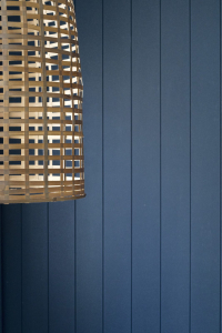
Credit: Style Curator
If your budget can accommodate some wall panelling, a simple 100m vertical joint board is synonymous with coastal design and is so effective at adding depth to an interior. The more interest you can achieve in your building materials, the less work you have to do in the decorating process.
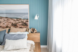
Credit: Kyal and Kara
Soft furnishings
It is however the decorating process that is always the cherry on top in interior design. Think of your soft furnishing choices like jewellery. The type of fabrics you choose for things such as your window dressings or bench seat cushion tops will decide whether your coastal home is casual, formal, contemporary, classic or whatever mood and style you want to achieve. Contrasting patterns and scale is a sure way to achieve a home packed with personality, which is a home you’ll always be proud of.
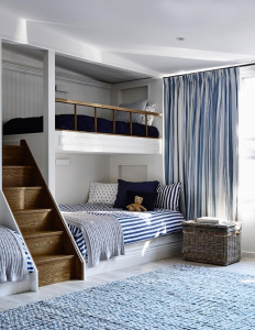
Credit: Adelaide Bragg
Let’s Get Started
Creating a mood board for the design of your future home will not only assist with communicating your vision to your colour-selection specialist but will also give you confidence in the outcome of your home design. A reference you can always go back to in future, keep your Coastal inspired mood board close during your home selections process.
Don’t forget to share with us your mood board design by tagging @ausmarhomes on Facebook and Instagram.
THINGS TO KNOW WHEN BUYING LAND
Looking to buy some land and build your dream home? Well, that dream can turn into a nightmare if you don’t know exactly what you’re purchasing. Here are some tips to help you get the best out of your new land purchase.
Zoning
Most land is zoned for a particular purpose, such as residential, industrial, commercial or recreational. When purchasing land, you need to make sure it’s in a residential zoned area, or you could have major problems when you try to build your home. The best thing you can do is check with the local council in your area, although your real estate agent should also be able to give you all the zoning information for a particular plot of land. Still, it never hurts to double check.
Always inspect the land personally
The other thing to consider is what the land actually looks like. Photos online usually look great, but they’re often taken for that very purpose. It always pays to go and visit the land yourself before any purchase. This ensures you see the whole property, not just the parts the real estate wants you to see online. There could be huge areas of overgrowth, access may be problematic, or the land could be sloped a lot more than the photo shows. All of these things can complicate the building process.
Check the soil quality
While most building companies recommend soil testing before starting a build, this can often be too late for many customers. If there are issues around soil quality, it can be a costly situation to deal with. This is a particularly important thing to consider if you’re building an acreage home in Queensland. That is if you want to do any sort of farming or raising of livestock. Soil quality plays a big part in how successful that venture will be, so it’s worth checking well in advance.
Before you sign on the dotted line for any land purchase, it’s good practice to consider soil testing in advance.
Water, power, and access
When buying land in normal residential areas, these issues don’t crop up too often. You’ll be connected to town water, electricity is no problem, and there’s usually easy access to the site for our builders. However, if the land you’re buying is more remote, you’ll need to think about all of these things.
Your builders need good access to the worksite, meaning you may have the expense of clearing a driveway before you even get started. If you need your own water and wastewater setup, this may be required before building. Also, builders need access to power during the build, so this will need to be sorted beforehand.
FIVE REASONS A KNOCKDOWN REBUILD IS RIGHT FOR YOU
Has your family outgrown your current home or its outdated design needs more than just a lick of paint? Rather than renovating or moving your entire life to a new suburb, an Ausmar knockdown rebuild may be the best solution for you. Our team will work with you to remove your old home and replace it with a new, modern design that perfectly suits your budget, lifestyle and land.
Keep reading to discover five smart reasons to consider a knockdown rebuild with Ausmar Homes.
1.It is often cheaper than a renovation
Removing your existing home and starting from scratch can be a cost-effective solution as it is generally cheaper per square metre to build a new home than it is to extensively renovate an old one. And with an up-front, fixed price building contract, you’ll avoid any of the costly “hidden” surprises often associated with renovations.
2. An Ausmar home can take just eight weeks to build
Extensive renovations are not only costly; they also take a long time to complete. With Ausmar’s three decades of experience, we have refined our construction schedule to be as condensed as just eight weeks for some designs. Even if you choose a larger home or custom design, our team of experts will provide you with a transparent building program so you know exactly when you’ll be moving into your new home.
3. Your new home will be exactly what you want
With a knockdown rebuild, there is no need to compromise on room sizes, design and finishes. A renovation may mean working around existing structures and layouts, while building from scratch gives you the freedom to design your home exactly the way you want it. Whatever your requirements and wishes, our team will work with you to design and build your perfect home.
4. You can stay in, or move to, the area you love most
Whether you’re replacing the home you currently live in, or have found the perfect old block in a suburb you admire, a knockdown rebuild allows you to live exactly where you want. In an increasingly tough property market, this approach can help to eliminate competition so you can move into your new home sooner.
5. It’s easier to make your new home more sustainable
Not only is an energy efficient home more environmentally friendly, it can save you more money in the long-run. It is much easier to make your home more sustainable when building from scratch as you can take advantage of your site’s orientation, choose sustainable materials and use energy efficient technology. All Ausmar homes meet the Queensland Government’s six-star energy rating requirements and we are always happy to work with clients to make their home even more sustainable if desired.
To find out whether your home is suitable for a knockdown rebuild, speak to one of Ausmar Homes’ experienced New Home Consultants at one of our display locations. Alternatively, you can contact the Ausmar Head Office on 07 5319 1500 or send us an enquiry here.
Q&A WITH OUR HOUSE & LAND CONSULTANT
Join our House and Land Consultant, Caitlyn, for an Instagram Q&A session this Wednesday 28 April at 6pm. Caitlyn will answer all your burning questions about how and where to find vacant land, our most affordable designs, considerations for a knockdown rebuild, and whatever else has been stumping you with the current housing market.
To get us started, Caitlyn has compiled answers to some of the questions she has received in the last few months.
Q: Is there any land available? If so, where?
Yes, there is! I work closely with real estate agents & developers all over South East Queensland, and have managed to secure blocks for my clients in Gympie, the Sunshine Coast and down to Brisbane. Often when blocks ‘fall over’ i.e. a customer pulls out of their initial hold on a block and developers will reach out to me to give Ausmar a chance to offer it to our qualified buyers.
Q: My block is only 10m x 25m – what are my options?
Lots of options with us! I am currently building my own Brooklyn on my 10mx25m block in Harmony. Best thing about this range of homes is it’s eligible for our Homein8. An 8-week build time sounds too good to be true, but it really is impressive watching it go up. You get into your home much quicker than standard build times which means less time paying for rent and holding costs on the land while you’re building. It’s an all-around win-win!
Q: What’s Ausmar’s cheapest design?
Any of our 3 bed, 1 garage, 2 living are our most cost-effective options. We can finish these homes from the $170,000 mark with all the bells & whistles our clients are looking for.
Q: I already have a block with an old house. Can I do a knockdown rebuild?
Absolutely! I think the knockdown rebuild space on the Sunshine Coast is the biggest opportunity for growth and great returns considering the lack of available land in new land estates.
My recommendation if you are considering doing a knockdown is to get in touch with us at the very start of the process. We will be able to look at your current block and site your new floorplan and can discuss the next steps in the process.
I find the biggest misconception about the knock down rebuild space is that you must go down the custom path, which you aren’t required to. You can choose any of our floorplans from our first series & designer range for your knockdown new build and I can assess to make sure it works on your block & within your budget.
Q: Can I make changes to my plan?
Short answer. Yes you can.
Long answer. Within reason. We have allowable ‘standard changes’ that helps keep the authenticity of our designs, such as moving a window or rearranging a bathroom within the same footprint. We understand that every client is different, and we want to build a home that will suit your needs.
Q: What do I need in case a block becomes available?
Finance Pre Approval
A holding deposit (usually around $1,000)
Be ready to complete the ‘expression of interest’ forms
Q: What is your favourite part of the process when helping a client/s build?
The design process. So many customers come to me deflated going through display villages being told how ‘expensive’ all the upgrades are and that they can’t achieve the house of their dreams. I love finding ways to make it a reality for them without breaking the bank! Our awesome standard inclusions really help with that!).
Q: Can you match another builders price?
Yes absolutely! I compare quotes for my customers all the time. There are big differences in builders inclusions and I can take you through them.
Q: I am a first home buyer & struggling to compare builders. What should I look for?
Standard inclusions VS base price.
Some builders might have a cheap base price but will give you no inclusions (i.e site works, no LED’s, no insulation, flyscreens or overhead cupboards). These things can all add up pretty quickly. Our base price is stacked with inclusions that you don’t have to pay for down the line.
Contact Caitlyn, our House & Land Consultant to discuss a house and land option that is tailored specifically to you and your lifestyle.


